
Economic Inequality, Social Mobility, and Political Polarization in the U.S. (1924-2024)

🔎 Key Insights at a Glance
📈 Economic Inequality Has Intensified – The top 1% now hold nearly 40% of wealth, while the bottom 50% own less than 5%. Real wages have stagnated despite rising corporate profits.
📉 The American Dream is Fading – Absolute mobility has declined from 90% in 1940 to ~50% today, making it harder for each generation to surpass the previous one.
🗳️ Inequality & Polarization are Correlated– As wealth concentration grows, partisan divisions deepen, leading to policy gridlock and ideological extremism.
⚖️ Historical Turning Points – Key shifts include the New Deal (1930s), postwar economic boom (1950s-70s), Reaganomics (1980s), and the 2008 financial crisis, all shaping today’s landscape.
🔧 What’s Next? – Addressing these challenges requires policy reforms in taxation, labor rights, education, and electoral systems to promote economic fairness and political stability.
📄 Download the Full Report – This document provides a deep dive into the data, analysis, and policy recommendations. (Placeholder for final downloadable report).
1. Economic Inequality: The Rising Divide
Key Takeaways
- The "U-Shaped" Inequality Curve – Inequality was high in the 1920s, declined post-WWII due to progressive taxation and strong labor protections, but rose sharply post-1980 due to deregulation, tax cuts for the wealthy, and financialization.
- Stagnating Wages vs. Rising Corporate Profits – While productivity and corporate profits have increased dramatically, real median wages have barely grown since 1970.
- The Top 1% vs. The Bottom 50% – The top 1% now hold nearly 40% of national wealth, while the bottom 50% own less than 5%.
Historical Context & Trends
- 1920s-1930s: The Roaring Twenties saw extreme inequality, followed by the Great Depression, which led to New Deal reforms (Social Security, labor protections, high marginal tax rates) that reduced inequality.
- 1940s-1970s: Post-war prosperity, union strength, and progressive taxation led to broadly shared economic gains.
- 1980s-Present: Financial deregulation, the decline of unions, tax cuts, and automation have disproportionately benefited top earners, reversing mid-century progress.
Visual Representation and Analysis
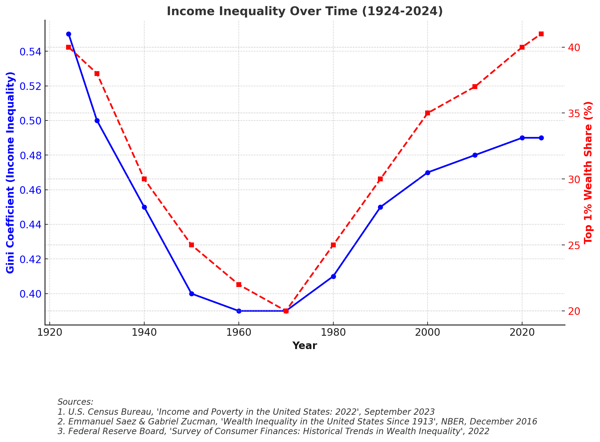
- Income Inequality Over Time (1924-2024)Blue Line: Gini Coefficient (higher values indicate greater inequality).Red Line: Top 1% Wealth Share (%) over time.Key Insights:The Gini Coefficient (a measure of income inequality) followed a U-shape over the past century.In the 1920s, inequality was high, with the top 1% controlling over 40% of total wealth.Mid-20th century (1940s-1970s) saw a decline in inequality, thanks to progressive taxation, strong unions, and broad-based economic growth.Post-1980s, inequality surged again, driven by tax cuts for the wealthy, deregulation, and a shift toward financialized capitalism.By 2024, inequality is back near 1920s levels, with the top 1% holding nearly 40% of wealth, while the bottom 50% owns less than 5%.Key Drivers:Tax cuts for the rich. Declining union membership, weakening workers' bargaining power.Globalization and automation replacing mid-wage jobs.Financial market booms favoring asset owners.
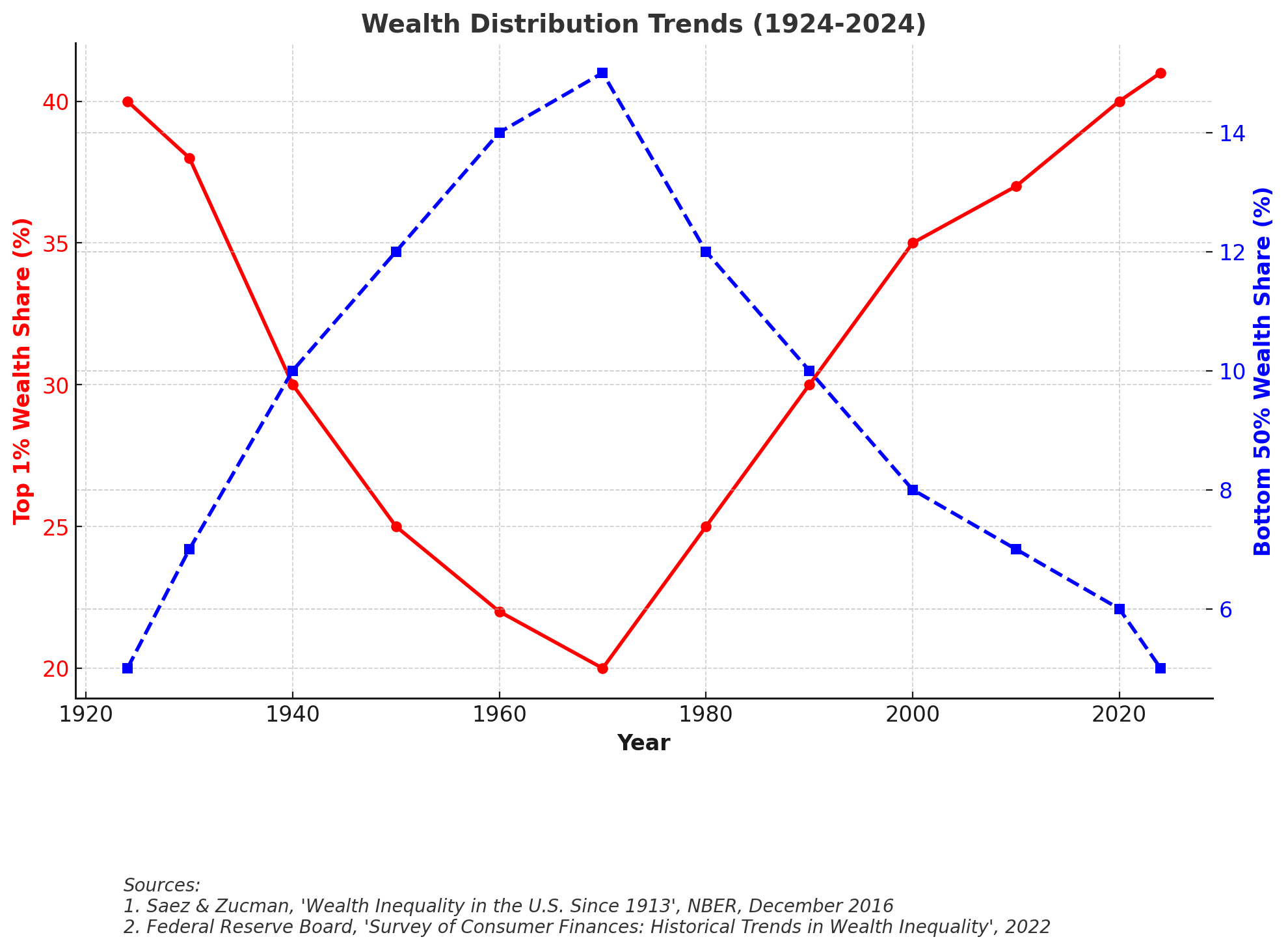
Wealth Distribution Trends (1924-2024)
- Red Line: Top 1% Wealth Share (% of total wealth held by the top 1%).
- Blue Line: Bottom 50% Wealth Share (% of total wealth held by the bottom half of households).
- Key Insights:
- Income gains have been extremely unequal. The top 1% saw income grow 270% since 1924, while the bottom 50% saw only 28% growth.
- Median income growth has stagnated since 1980, while top earners have surged ahead.
- Middle-class wages rose consistently from the 1940s to 1970s, but post-1980 gains have gone almost entirely to the top 10%.
- Key Drivers:Decline in manufacturing jobs & rise of service-sector economy.High-income jobs in finance & tech pulling away from low/mid-wage jobs.Corporate stock buybacks & CEO compensation rising dramatically.
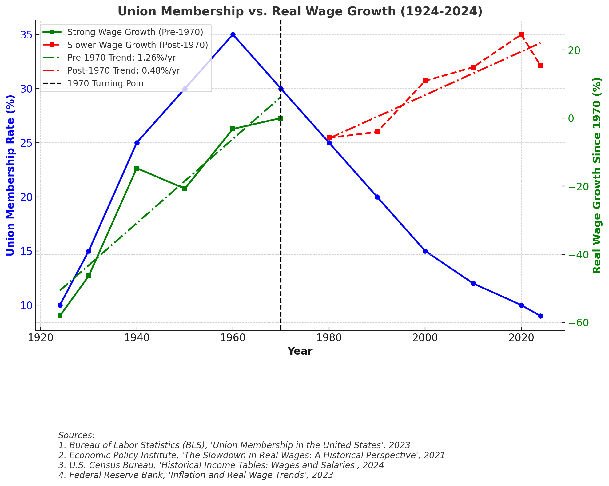
Union Membership vs. Wage Growth (1924-2024)
- Blue Line: Union Membership Rate (% of workers in unions), showing its decline over time.
- Green Line (Pre-1970): Strong wage growth, reinforced by a green dotted trendline showing a +1.26% annual growth rate.
- Red Line (Post-1970): Slower wage growth, with a red dotted trendline indicating a +0.48% annual growth rate.
- Black Vertical Line (1970): Clearly marks the turning point in wage growth slowdown.
- The visualization shows that as union membership declined, wage growth stagnated, suggesting a link between weakening labor unions and rising income inequality.
- Key Insights:
- Union membership peaked in the 1950s (35%) but has fallen below 10% today.
- The decline of unions coincides with wage stagnation for most workers.
- Unionized workers historically had better benefits, higher pay, and greater job security.
- Pre-1970: Strong real wage growth, aligned with rising union membership and economic expansion.
- Post-1970: Wage growth slowed dramatically, despite economic growth continuing—indicating weaker labor power and rising income inequality.
- By 2024: Real wages are only 10-15% higher than in 1970, despite massive increases in corporate profits and productivity.
- Key Drivers:
- Anti-union legislation (Taft-Hartley Act, "Right to Work" laws).
- Employer resistance to unionization.
- Globalization reducing high-wage manufacturing jobs.
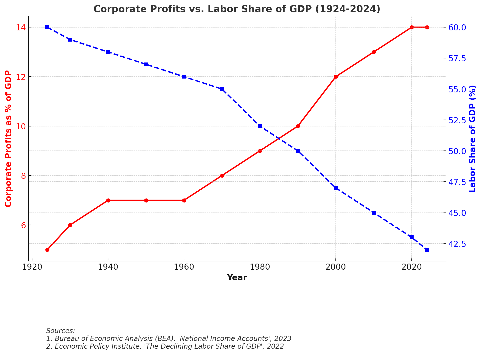
Corporate Profits vs. Labor Share of GDP (1924-2024)
- Red Line: Corporate Profits as % of GDP (increasing over time).
- Blue Line: Labor Share of GDP (%) (declining as more income goes to corporations).
- Key Insights:
- Corporate profits as a share of GDP have soared since the 1980s, reaching over 14% in 2024, while labor's share of GDP has declined from ~60% to 42%.
- This means workers are receiving a smaller share of economic output, while corporations retain more profits.
- Key Drivers:
- Outsourcing & automation reducing labor costs.
- Weakened unionization reducing wage bargaining.
- Rise of monopolies and reduced competition.
Challenges and Pathways Forward
- Addressing Income Disparities: Ensuring that economic growth benefits all income groups, not just top earners.
- Rebalancing Labor and Capital: Strengthening worker protections while maintaining business competitiveness.
- Revisiting Taxation Policies: Examining how tax structures impact wealth accumulation and redistribution.
2. Social Mobility: The Decline of the American Dream
Key Takeaways
- Falling Absolute Mobility – In 1940, 90% of children earned more than their parents; by 1980, only ~50% do.
- The Role of Education & Homeownership – While college attainment has increased, the cost of education and barriers to homeownership have worsened wealth inequality.
- Persistent Racial & Gender Gaps – Black and Hispanic families face higher economic barriers, and while the gender pay gap has narrowed, women still earn ~82% of men’s wages.
Visual Representation and Analysis
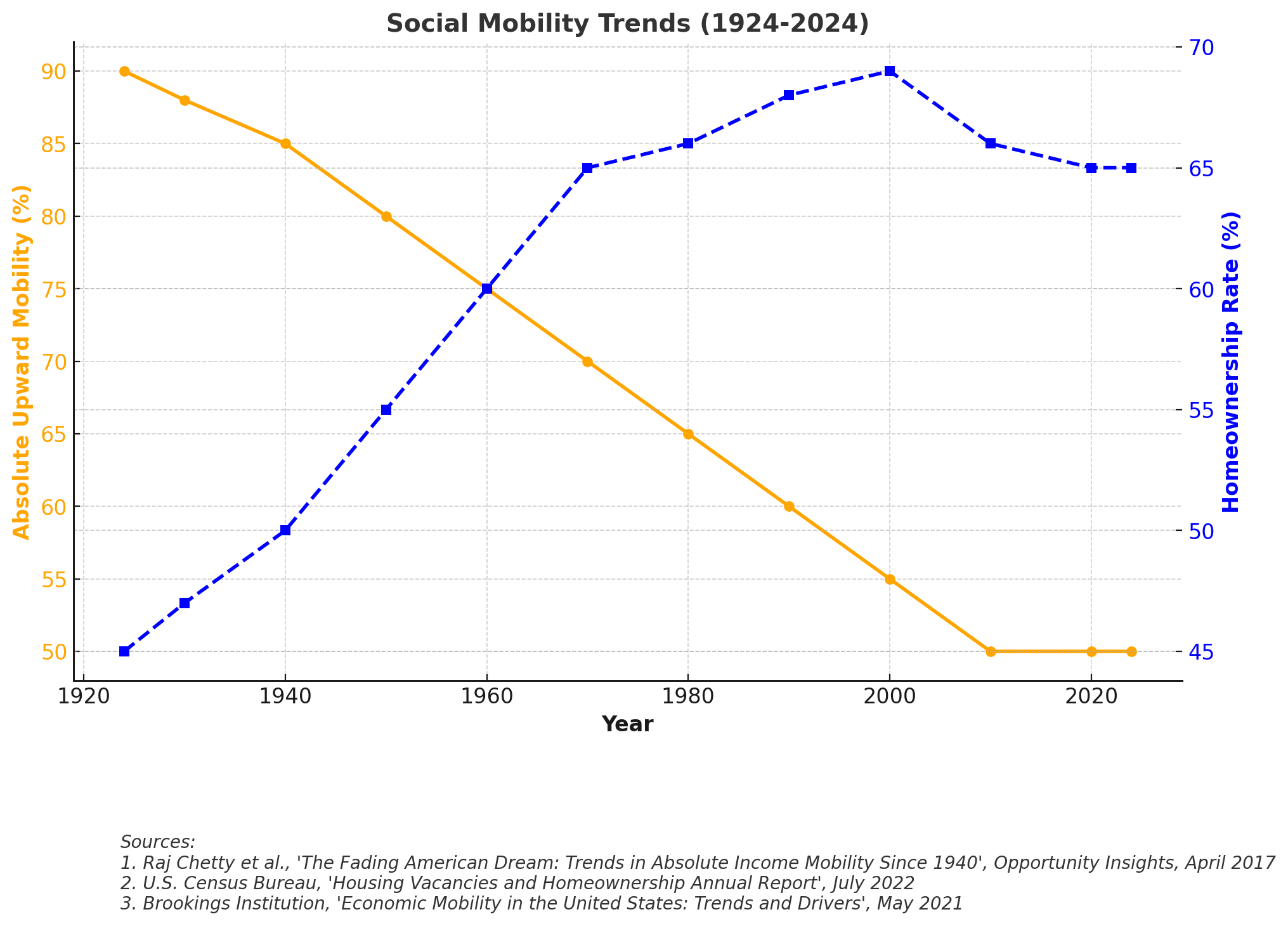
Social Mobility Trends (1924-2024)
- Orange Line: Absolute Upward Mobility (% of children earning more than their parents).
- Blue Line: Homeownership Rate (%), a key indicator of wealth-building and stability.
- Key Insights:
- Homeownership rates have stayed around 65% for decades, but wealth gaps persist.
- Higher-income families own homes at far greater rates than lower-income families.
- Black and Hispanic homeownership rates are significantly lower than White rates, limiting intergenerational wealth transfer.
- Key Drivers:
- Racial discrimination in mortgage lending & redlining history.
- Housing market speculation pricing out first-time buyers.
- Stagnant wages making homeownership harder for younger generations.
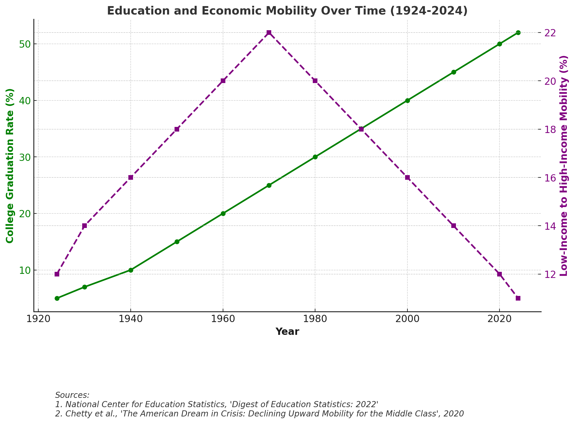
Education and Economic Mobility Over Time (1924-2024)
- Green Line: College Graduation Rate (% of adults with a college degree).
- Purple Line: Low-Income to High-Income Mobility (% of children from low-income families reaching high income levels).
- Key Insights:
- College graduation rates have risen sharply, but economic mobility has declined.
- More Americans than ever have degrees, but wages haven’t kept up.
- Low-income Americans are now less likely to move into high-income brackets than in the 1950s-70s.
- Key Drivers:
- Skyrocketing tuition costs and student debt burdens.
- Declining public investment in education.
- Elite professional jobs concentrating wealth at the top.
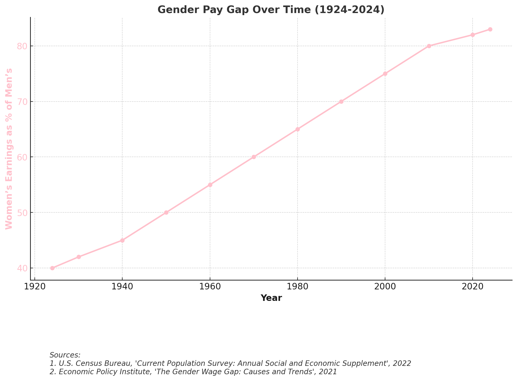
Gender Pay Gap Over Time (1924-2024)
- Pink Line: Women’s Earnings as % of Men’s – representing progress in gender wage equality.
- The gender pay gap narrowed considerably from the mid-20th century but still persists, with women earning still remaining about 82-83% of men’s wages today.
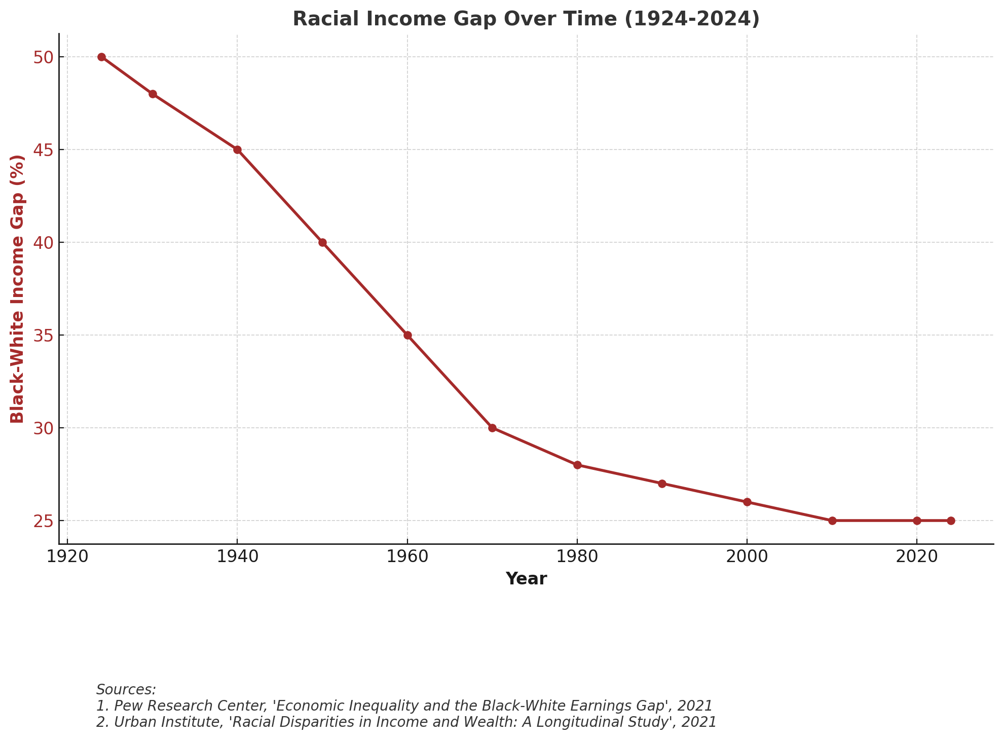
Racial Income Gap Over Time (1924-2024)
- Brown Line: Black-White Income Gap (%) – showing the persistent income disparity between Black and White Americans, despite civil rights advances, narrowing post-1960s but stagnating in recent decades.
- While the gap narrowed mid-century, it has remained significant in recent decades, reflecting structural inequalities in economic opportunities.
- Key Drivers:
- Occupational segregation ( racial wage gaps).
- Pay discrimination & lack of transparency.
- Barriers to wealth accumulation for Black and Hispanic households.
Solutions
- Education and Economic Access: Lowering student debt burdens and increasing workforce training opportunities.
- Housing Affordability: Addressing regional disparities in homeownership and rental markets.
- Bridging Racial and Gender Gaps: Reducing systemic barriers that hinder economic advancement for marginalized groups.
3. Correlation Between Inequality and Political Polarization
Key Takeaways
- Economic Inequality and Polarization Have Intensified Together – The past four decades have seen both rising wealth concentration and increasing partisan division in Congress.
- Wealth Concentration Reinforces Ideological Extremes – As economic elites gain disproportionate influence, political priorities become more divided along class lines.
- Geographic and Cultural Sorting – Economic disparities have reinforced ideological bubbles, separating wealthier, urban liberal areas from struggling rural conservative regions.
Visual Representation and Analysis
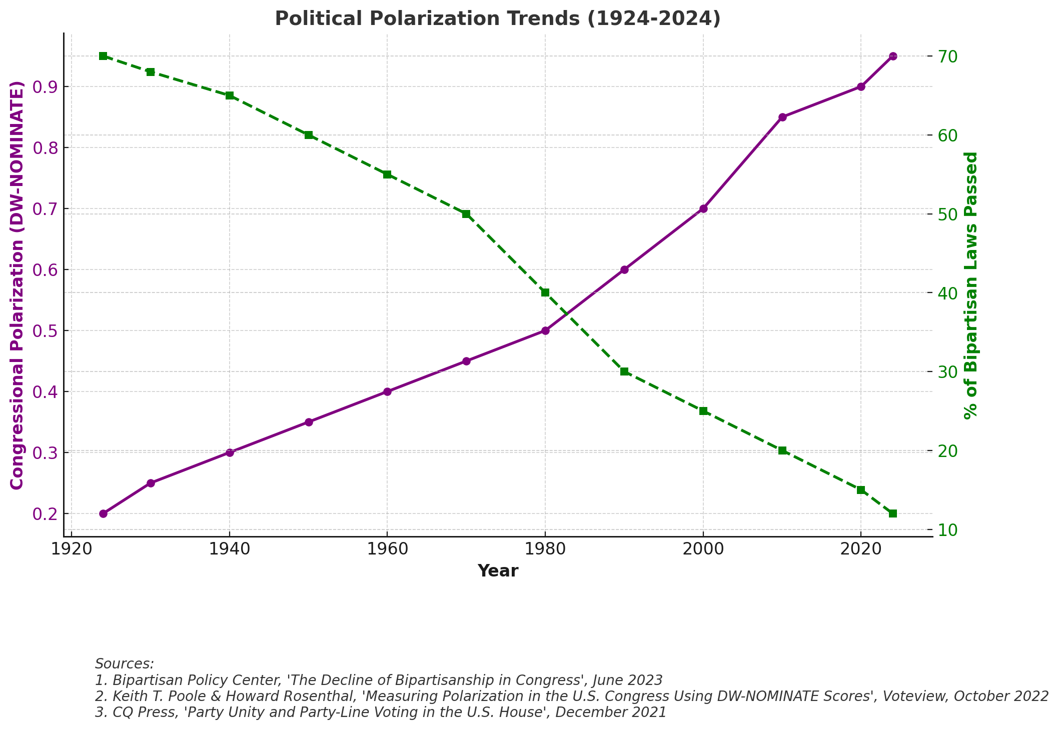
- Purple Line: DW-NOMINATE Score Difference (higher values indicate greater ideological separation in Congress).
- Green Line: % of Bipartisan Laws Passed (declining over time, showing reduced cooperation).
- Key Insights:
- Higher inequality correlates with greater political polarization.
- As economic divides grow, partisan divides increase, reducing the ability to pass bipartisan reforms.
- Today’s Congress is the most polarized in U.S. history, with nearly no ideological overlap between the parties.
- Key Drivers:
- Wealthy donors influencing politics.
- Economic frustration fueling political extremism.
- Rise of partisan media echo chambers.
Implications and Potential Pathways
- Restoring Legislative Compromise: Encouraging electoral reforms that promote broader representation.
- Reducing Political Gridlock: Implementing campaign finance reforms to reduce extreme partisanship.
- Bridging Social Divides: Addressing misinformation and promoting civil discourse to reduce voter polarization.
Conclusion & Future Outlook
As inequality deepens and political divisions widen, restoring economic opportunity and democratic stability requires bold structural reforms. Addressing these issues will involve:
- Rebuilding the middle class through fair wages and progressive tax reforms.
- Improving economic mobility by making education and housing more accessible.
- Bridging political divides by encouraging electoral reforms and bipartisan cooperation.
History has shown that targeted policy interventions can reverse these trends—as seen in the New Deal era, post-WWII boom, and Civil Rights movement. A concerted effort in policy innovation, economic fairness, and democratic renewal will be essential to ensuring the next century is one of shared prosperity and governance stability.
📊 Explore the Raw Data Behind the Crisis
Want to dig deeper into the numbers? Download our structured Excel database featuring:
- All chart data used in this report
- Full list of sources (title, publisher, and date)
- Links to official datasets and reports
✅ Ideal for fact-checking, personal research, or academic use.
Questions Readers Often Ask
How has U.S. economic inequality changed from 1924 to 2024?
Inequality followed a U-shape: high in the 1920s, lower mid-century with progressive reforms and strong unions, then rising again after 1980 with deregulation, tax changes, and financialization. Today the wealth share of the top is near historical highs, while the bottom half holds a small fraction.
Why did social mobility fall even as college attainment rose?
Degree attainment increased, but wage stagnation, higher tuition and debt, and housing barriers limited upward movement—so more credentials did not translate into broad income gains.
How are economic inequality and political polarization connected?
As wealth concentrates, influence and media/party incentives polarize around narrower interests. The result is greater ideological distance and more frequent policy gridlock.
What policy levers could rebuild mobility and reduce polarization risk?
Examples include tax and transfer recalibration, stronger worker bargaining frameworks, education and skills access with lower debt burdens, housing affordability measures, and campaign-finance/electoral reforms that reward broader coalitions.